Relengo: a brand a startup can carry on its own
A brand for Relengo, a peer-to-peer rental startup launching in Germany, built on one visual metaphor — value grows when it moves — so the founders can carry it on their own, with one look and one voice in the app and on social media.
Location: Germany · Industry: Peer-to-peer rental marketplace · Services: Branding · Year: 2025
In short
- Challenge: A P2P rental startup launching in Germany needed a whole brand it could run on its own across the app and social media — one that makes people trust strangers with their things.
- What we did: Research, design session, brand platform, two visual directions, a logo refined over several rounds, a full brand guide, social media templates and the first two app screens.
- Result: The Relengo team carried the brand on without us and built on it their German and English site and their Instagram.
Challenge
Relengo connects people who own things with people who need them for a while — from hiking gear to tools. “Use without owning. Earn without selling.”
The idea is simple, but the category is hard: people need to trust strangers with their belongings. The startup was about to launch in Germany and needed a brand that feels trustworthy enough for a marketplace, yet warm and simple enough for everyday use.

What success looks like
- Who it serves: someone in Germany with a drill or a tent they rarely use, wondering whether a stranger will bring it back — and the renter on the other side.
- What they need: a reason to trust the platform, and each other, from the first screen.
- Why it matters for Relengo: the whole idea — use without owning, earn without selling — only works if people lend; without trust there is no supply.

How we worked
1. Design session and references
We began with a design session with the founders to agree on mission, vision and brand attributes: trustworthy, community-driven, sustainable, smart. Then we studied the closest references — Getaround, Uber and HomeExchange — to see what builds trust in sharing platforms and what to avoid.
2. Visual references and rules
Before drawing a logo, we showed visual references in two groups — “yes” and “red flags” — and turned the feedback into ten clear rules: simple and friendly, not sterile; grids and dots, not natural textures; humanist type, no gradients; real photos of happy people, not stock. Relengo should sit between Uber, which felt too corporate, and Getaround, which felt too messy.
3. Brand platform
From the session we built the brand platform: mission, vision and values agreed with the founders, and the brand idea — value grows when it moves.

4. Visual directions and logo
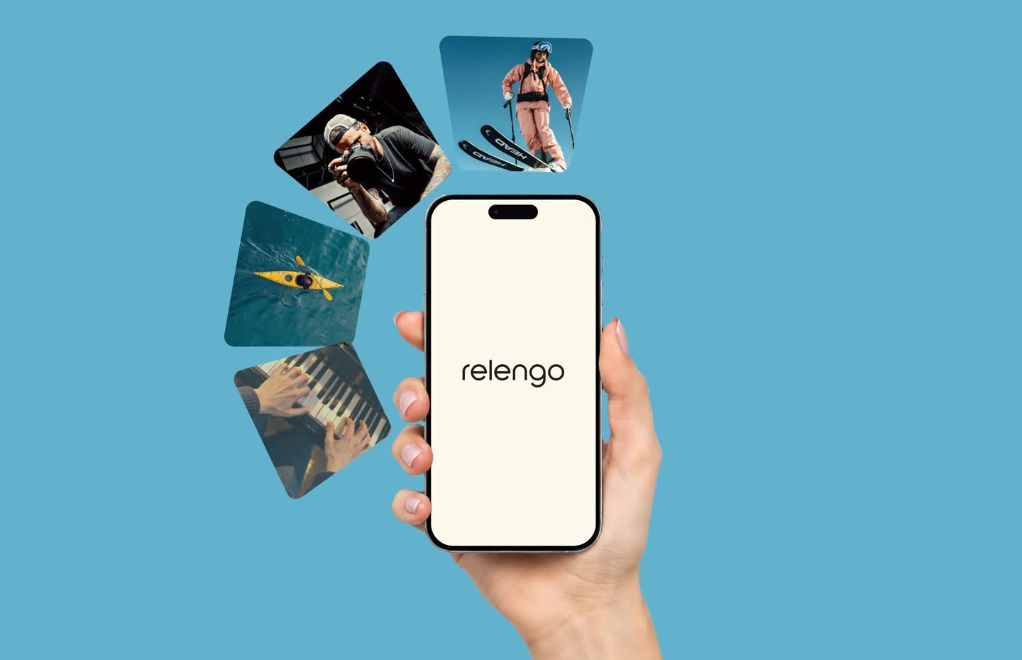
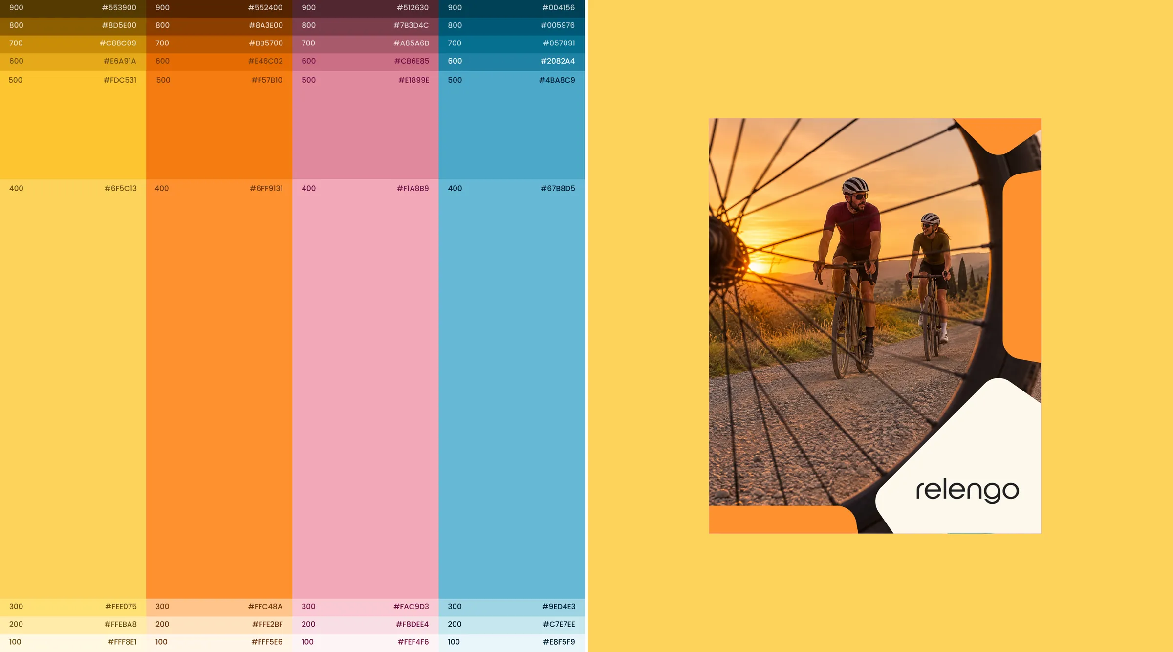
First we showed two visual directions, then refined the logo over several rounds of concepts until one fit both the rules and the idea. The result: overlapping rounded shapes for flow and exchange — the cycle element — as a logotype, symbol and app icon, with warm accents on beige and black, Poppins, colourful category icons and real photos of people.

5. First app screens
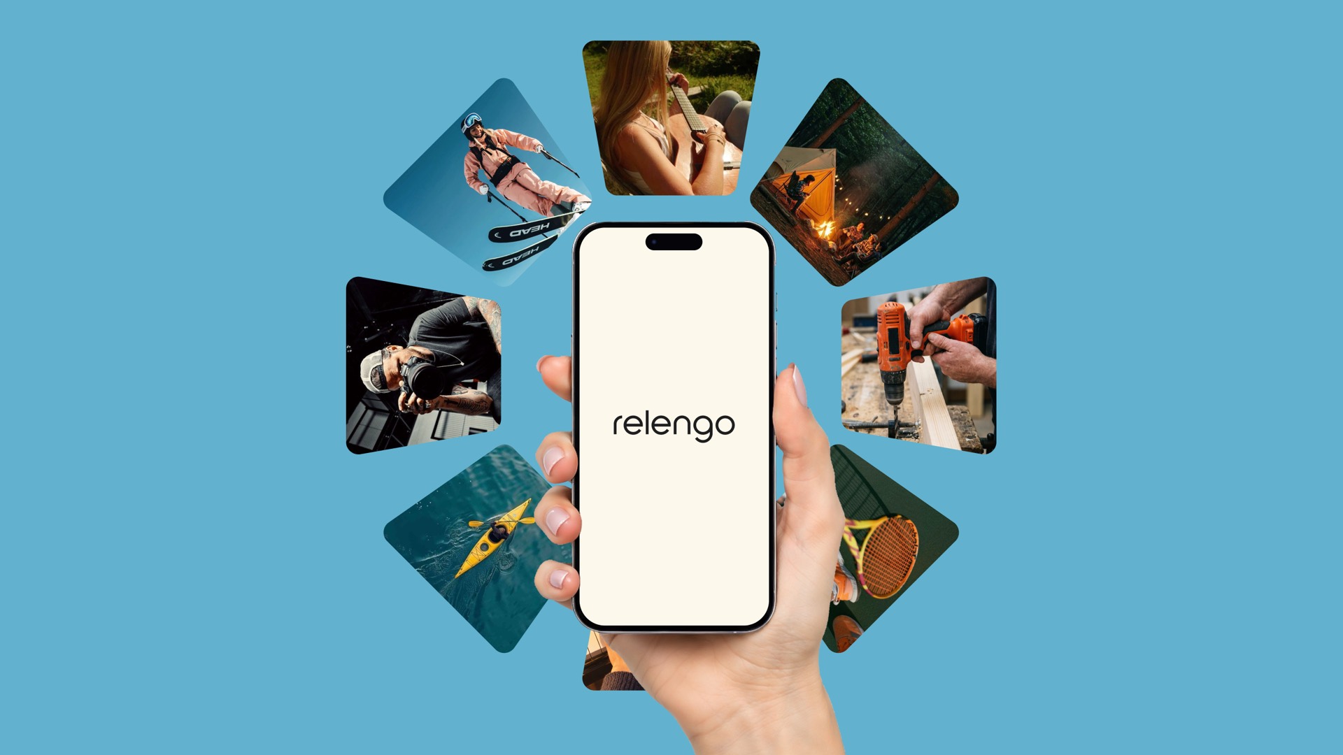
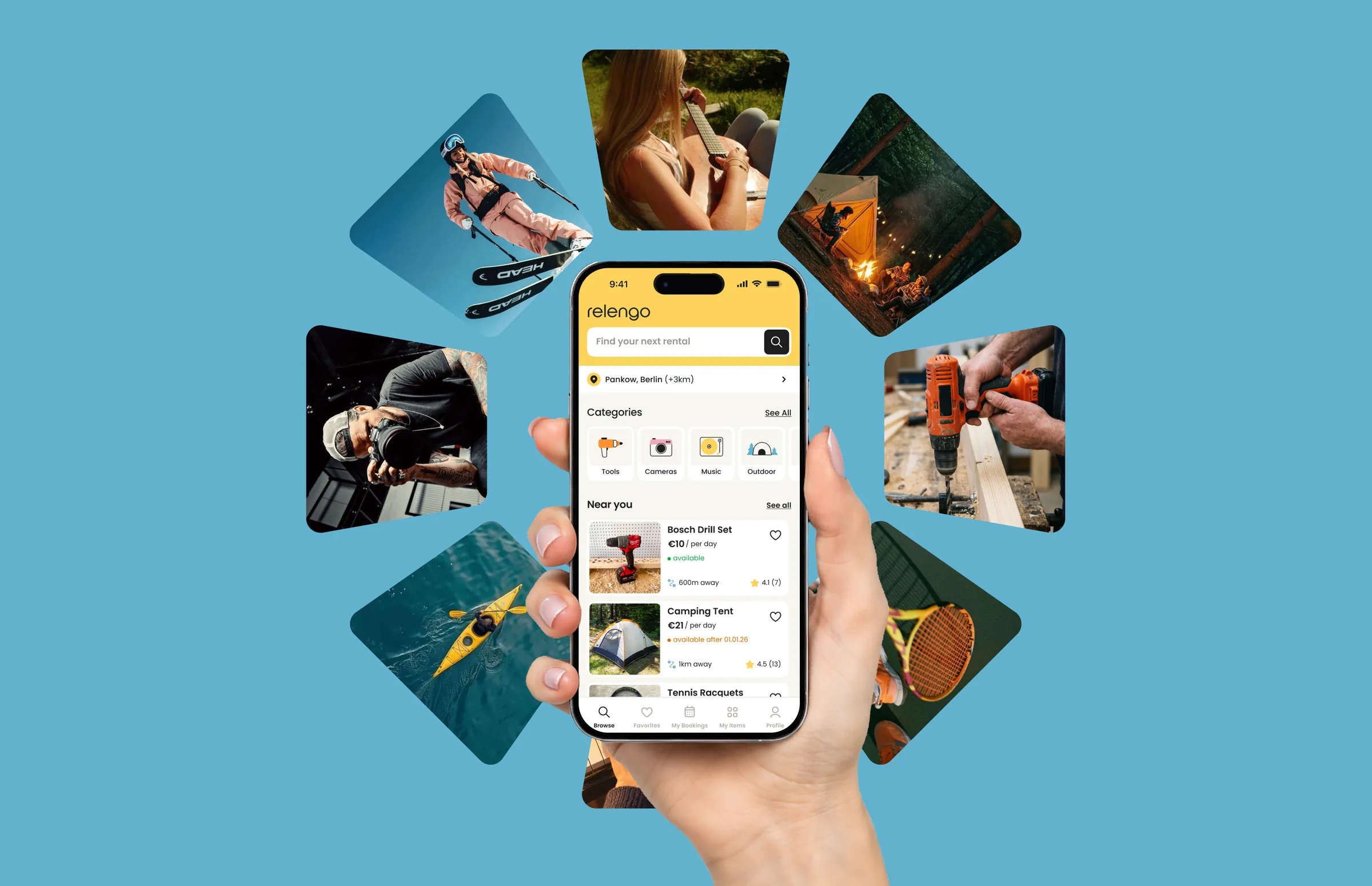
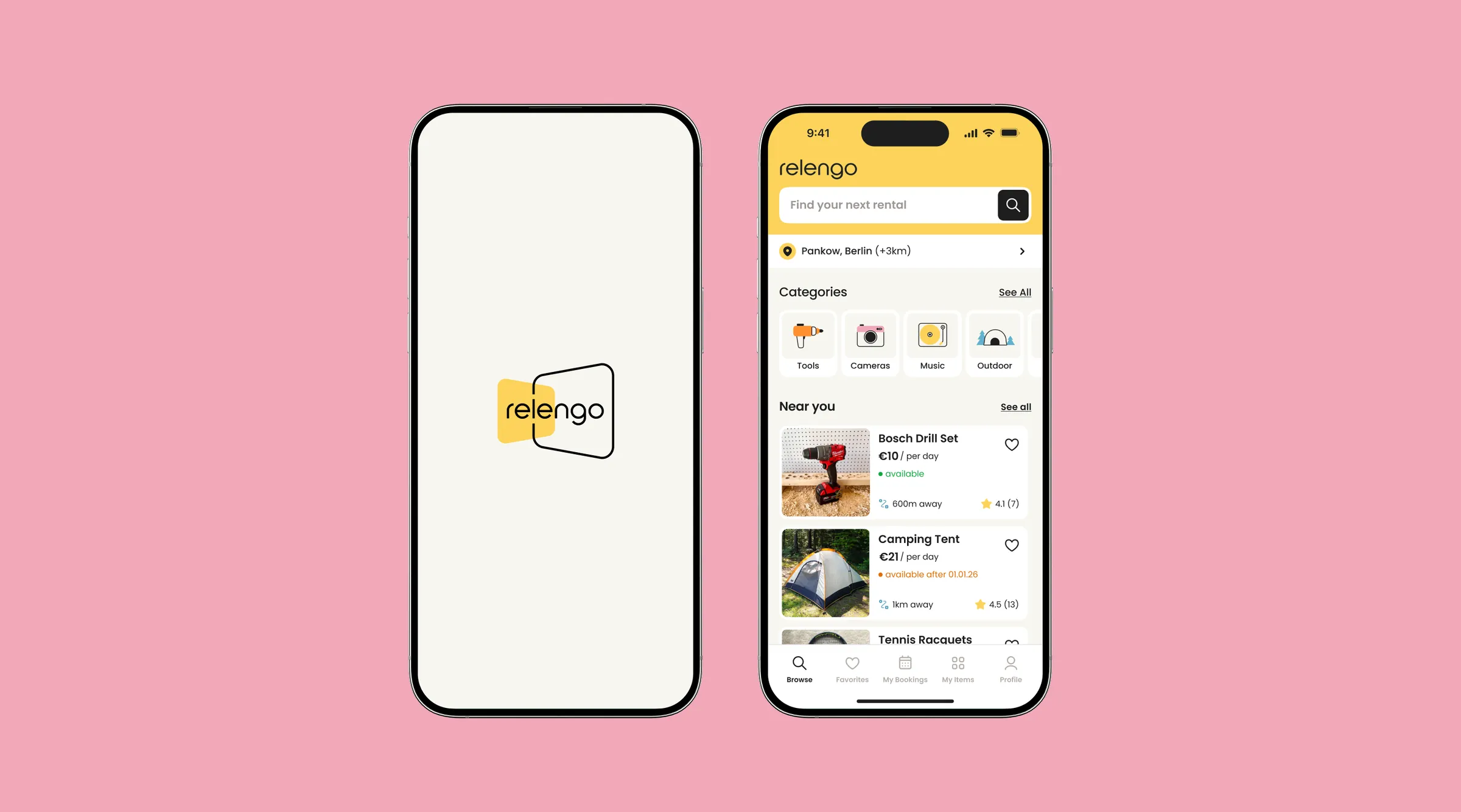
A splash screen and a home screen with search, location, categories and items near you, built on UI rules: one corner radius, a 4-px grid, colours tested for WCAG AA and AAA.
6. Brand guide and social media templates
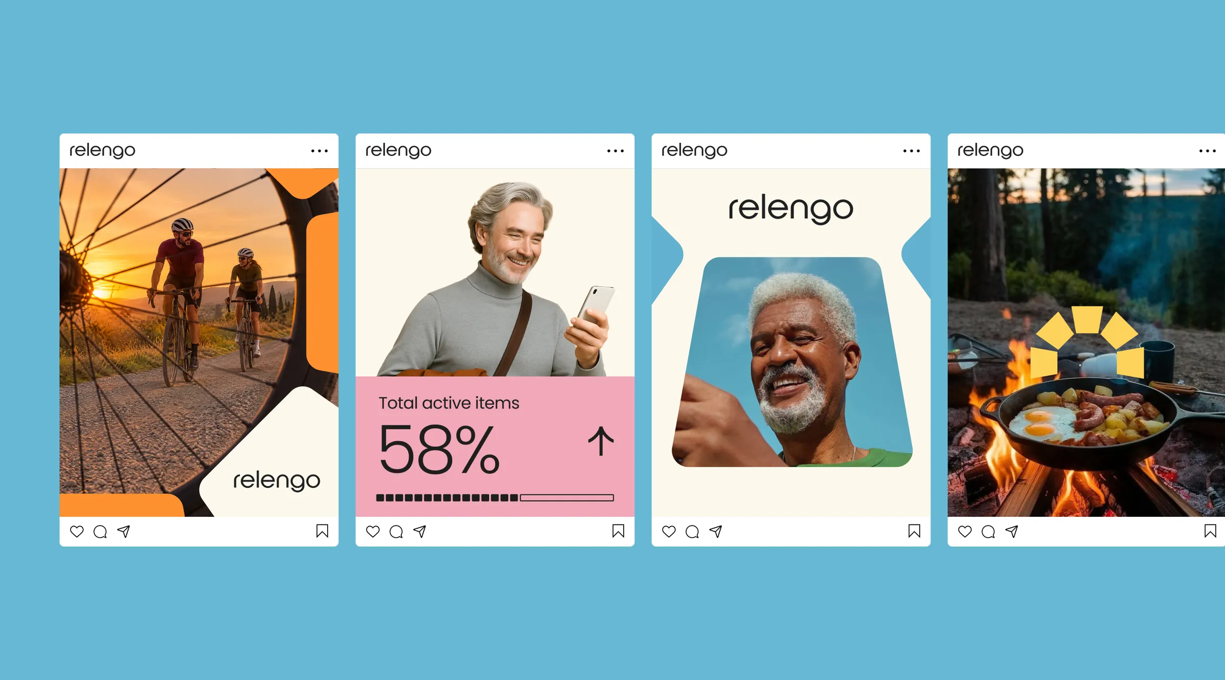
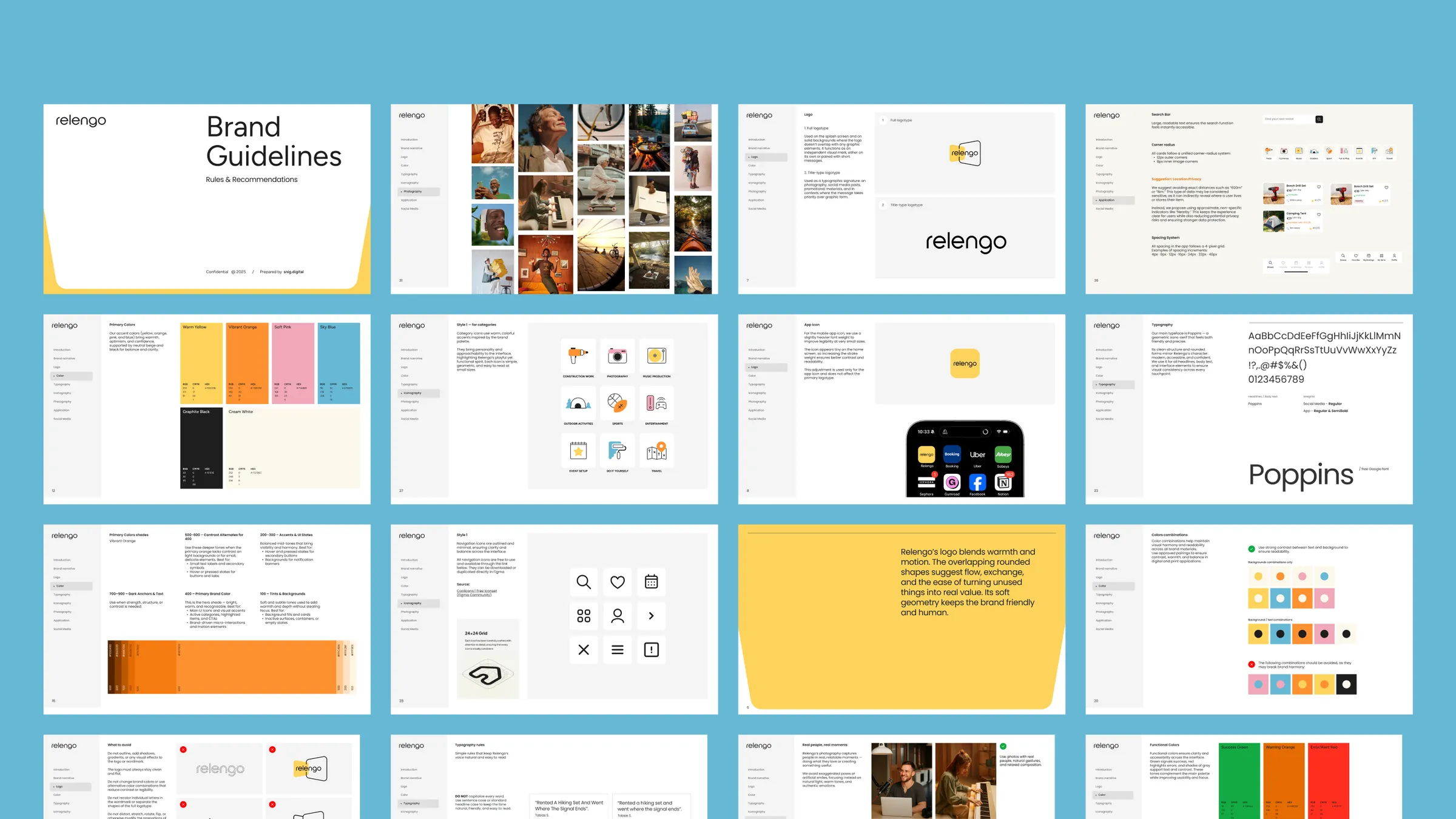
Everything went into a full brand guide — logo, colour, type, icons, photography, social media and the app — plus social templates with the cycle element, so the founders could see how the brand works in each channel before taking it over.
Key decisions
- One visual metaphor for the whole brand — the cycle element shows the brand idea, so the founders can carry it to any channel and the brand stays whole without us.
- Show every concept in real use — visual directions and logos were shown as an app icon on a phone and in a social feed, so the founders judged them the way their users would see them.
Result
The founders carried the brand on without us: they built their German and English site on it and launched their Instagram. The site leads with trust — verified users, payment held until handover, photos at both ends — the idea at the core of the brand platform.
Team
Yulia Snitko — project manager
Gala Nagorna — art director
Yuliia Konovalenko — brand designer
See the case page: Relengo.