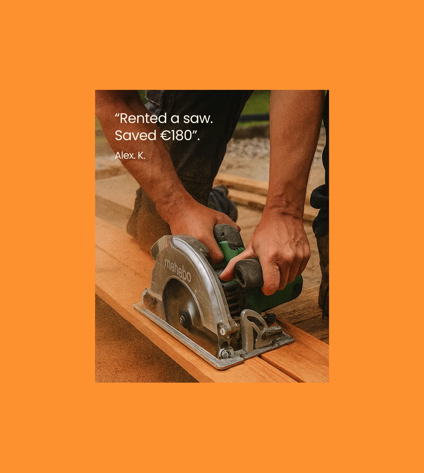
A peer-to-peer rental startup launching in Germany needed one brand for social media, presentations, print and the website — one the founders could run on their own.
“
Relengo connects people who own things with people who need them for a while — from hiking gear to tools. “Use without owning. Earn without selling.”
The idea is simple, but the category is hard: people need to trust strangers with their belongings. So the brand had to feel trustworthy enough for a marketplace, yet warm and simple enough for everyday use.
We started with a design session with the founders — mission, vision and brand attributes: trustworthy, community-driven, sustainable, smart. Then we studied what builds trust in Getaround, Uber and HomeExchange. Relengo had to sit between Uber, too corporate, and Getaround, too messy.
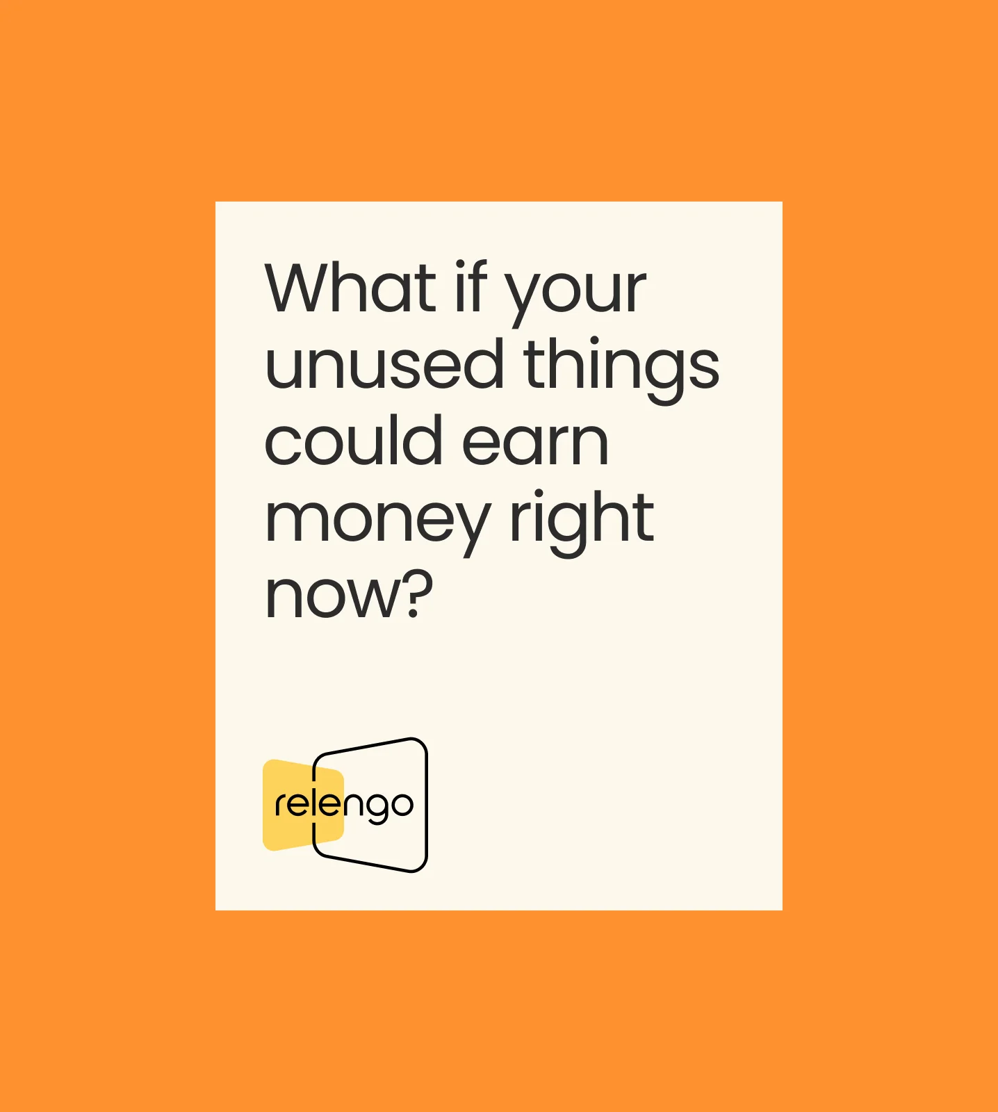
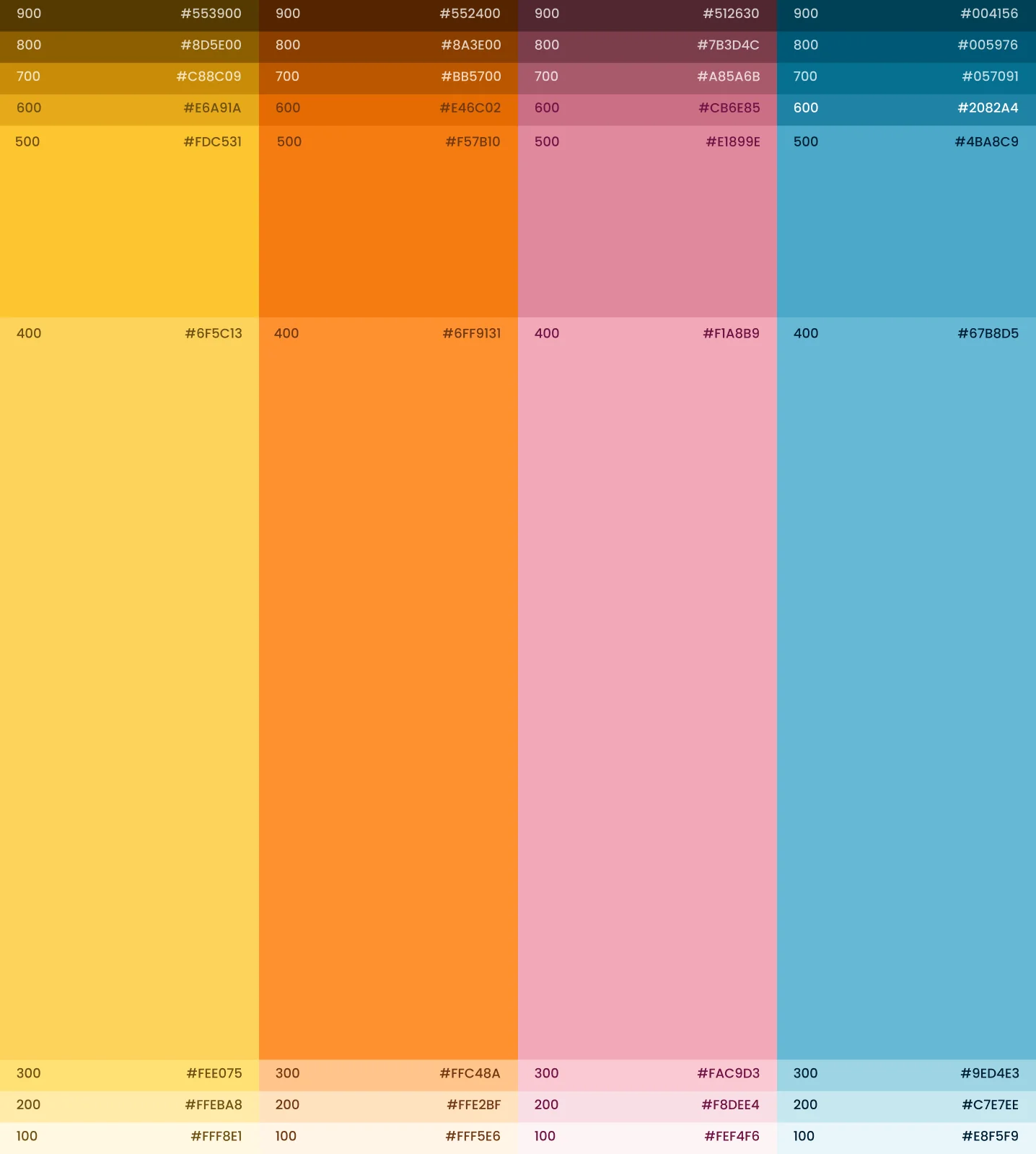
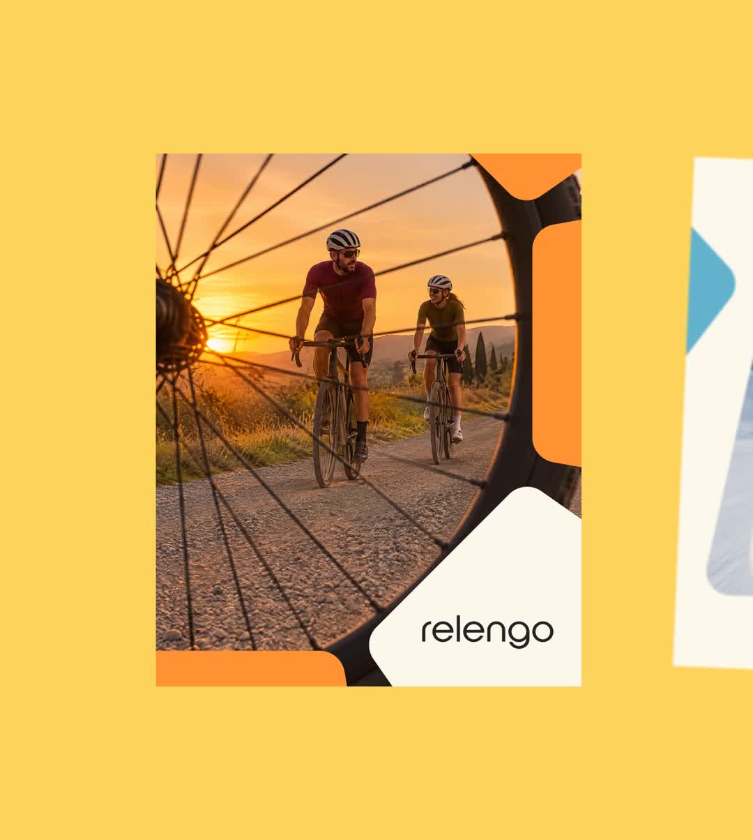
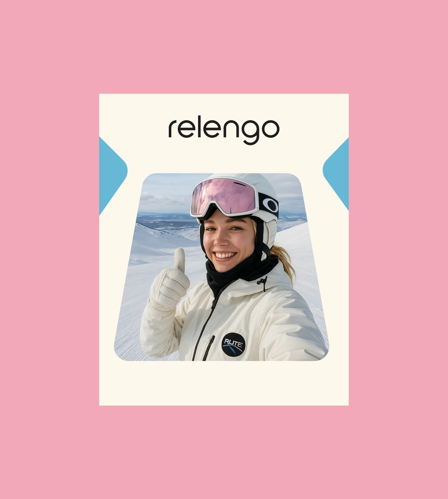
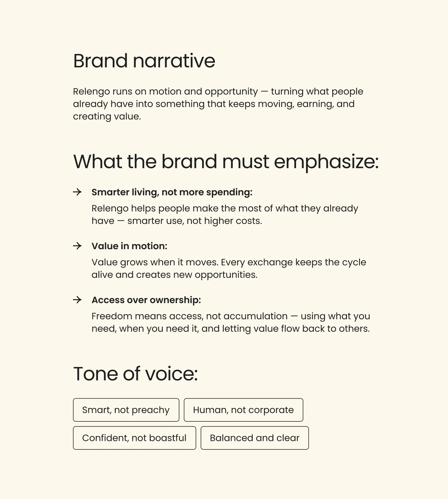
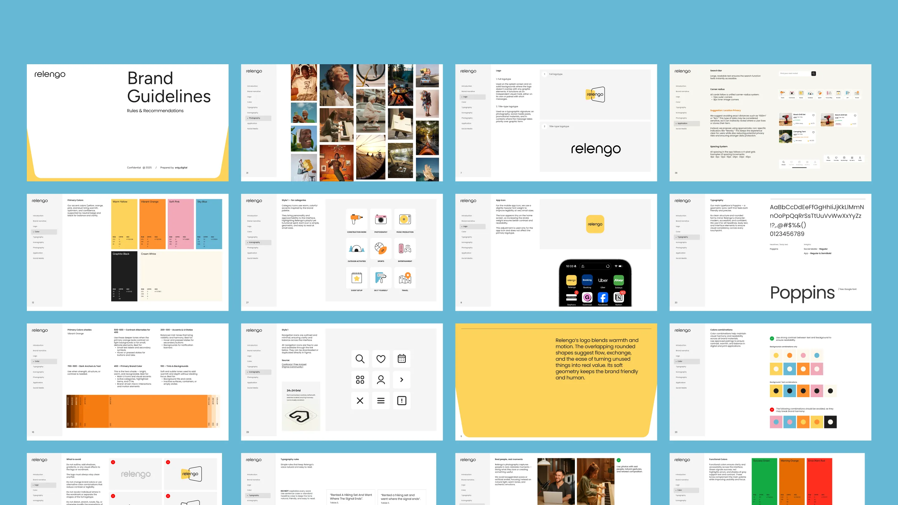
That led to the brand idea, “Value grows when it moves,” and to the cycle element: overlapping rounded shapes for flow and exchange. It is the logo, symbol and app icon, and it runs through warm colours, Poppins, colourful category icons and real photos of people.
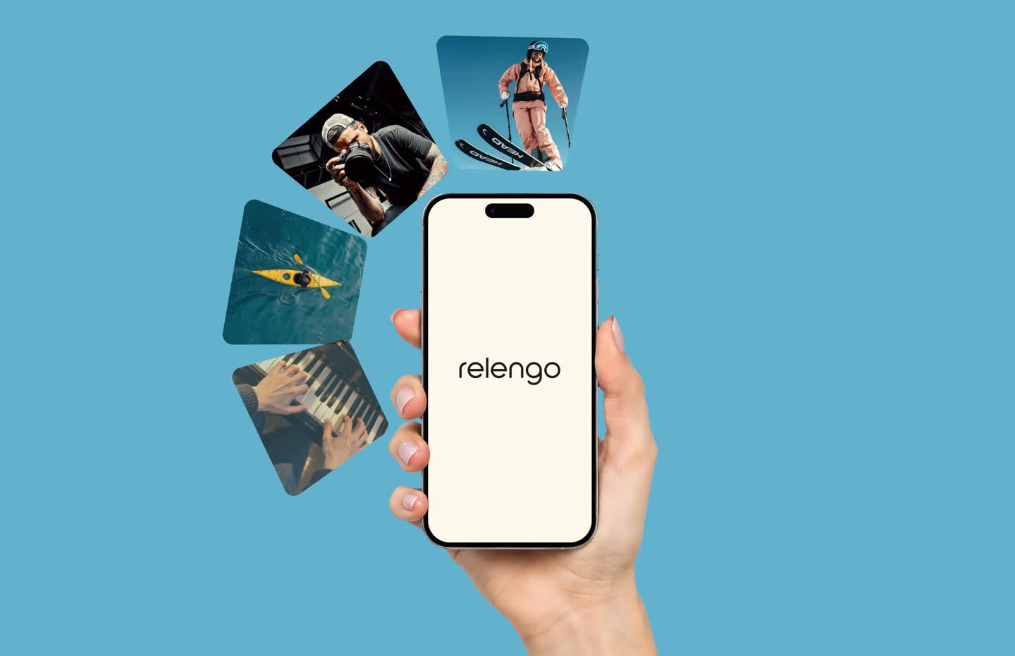
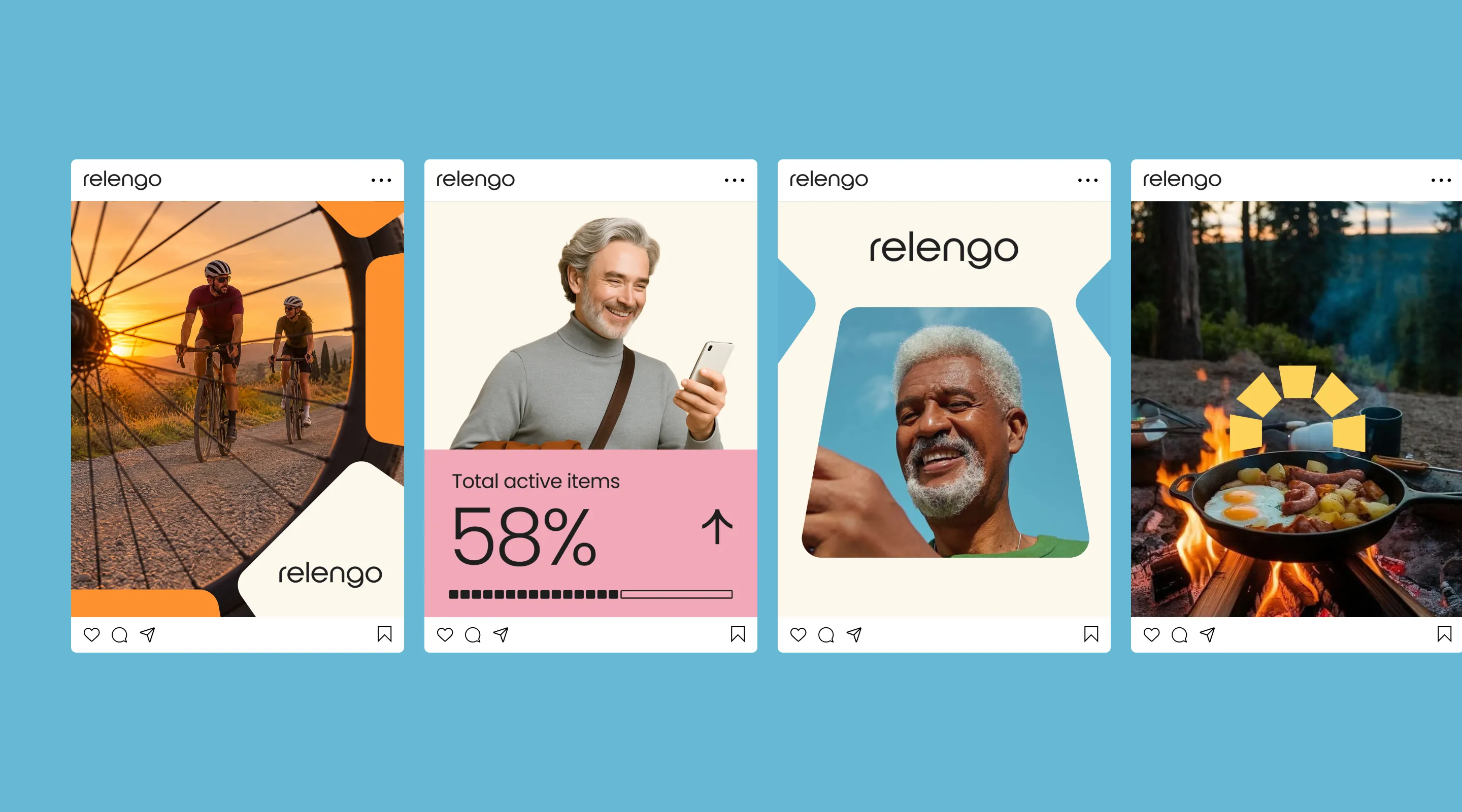
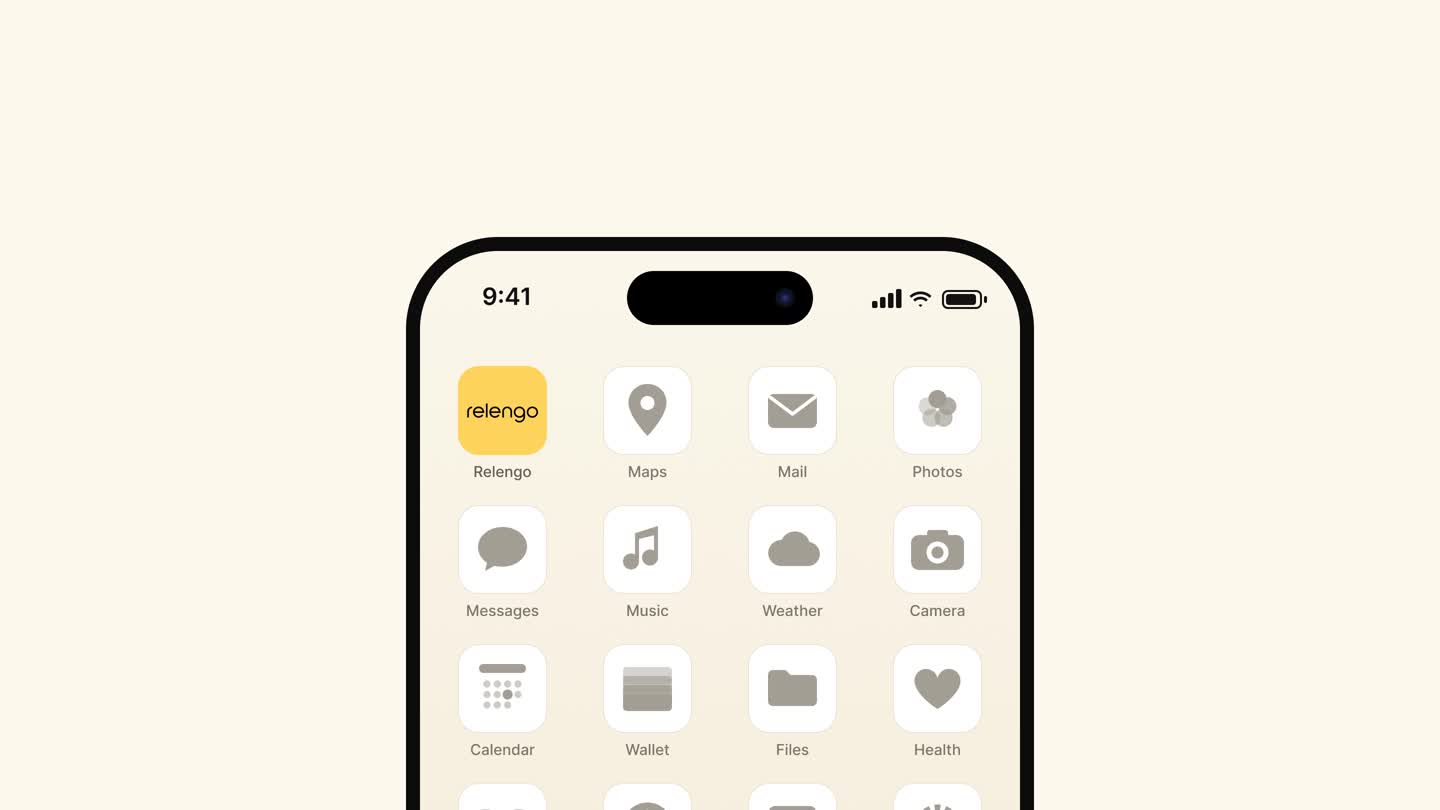
Everything went into a full brand guide and social templates. We showed every concept in real use — as an app icon on a phone and in a social feed — so the founders judged it the way their users would.
The founders carried the brand on without us: they built their German and English site on it and launched their Instagram. The site leads with trust — verified users, payment held until handover, photos at both ends.
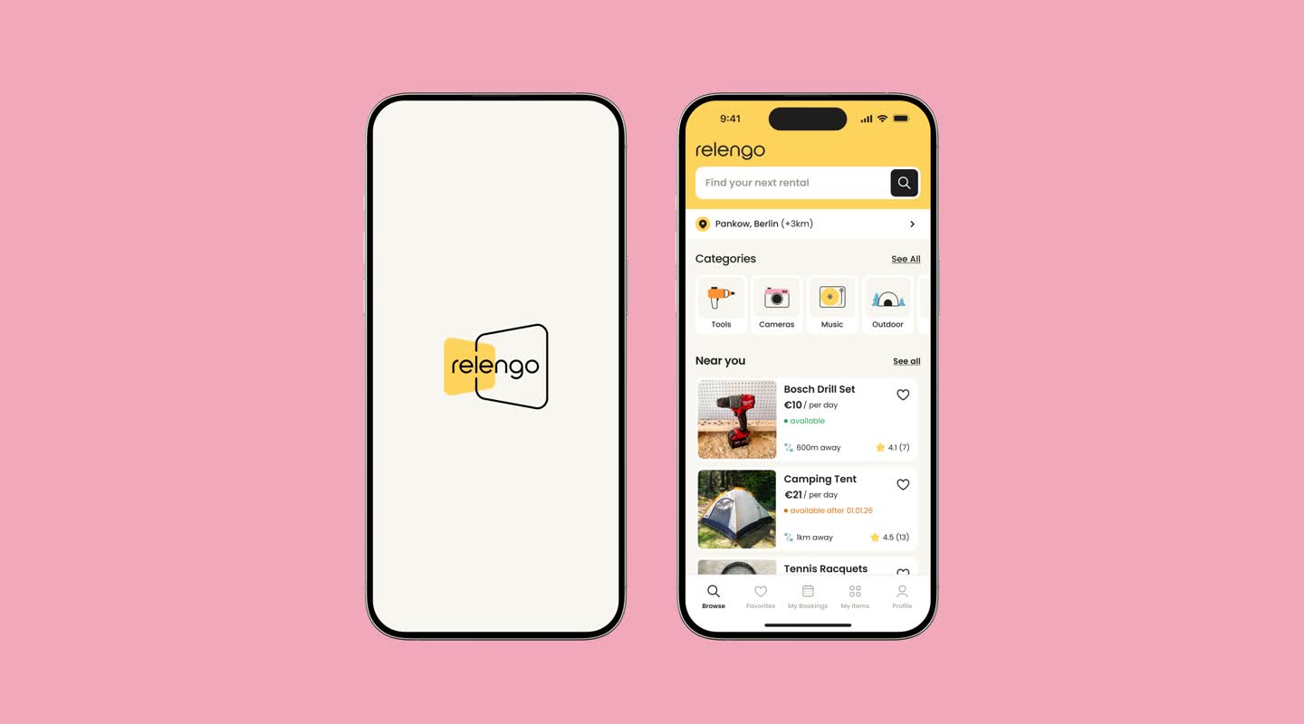
We also handed over the first app screens — splash and home — built on one corner radius, a 4-px grid and colours tested for WCAG AA and AAA.