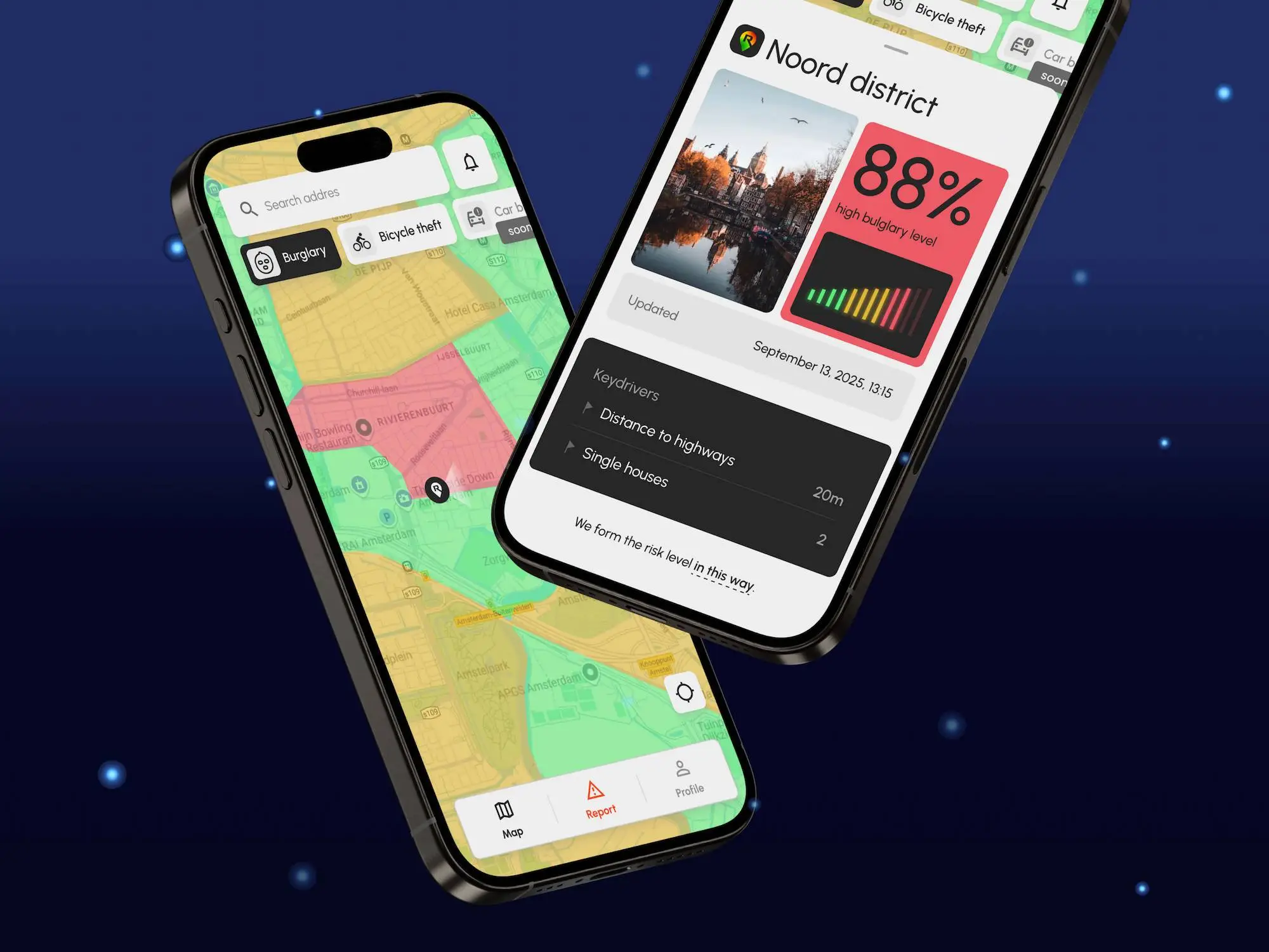
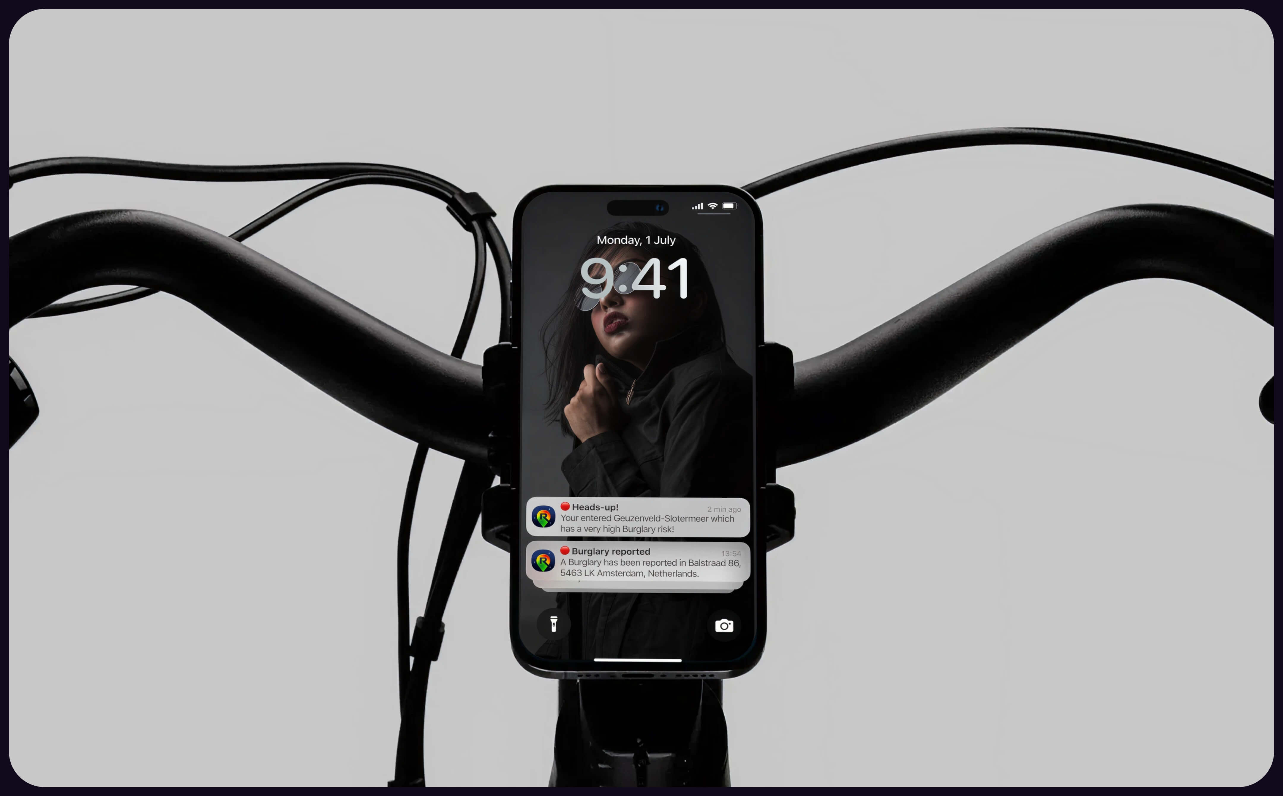
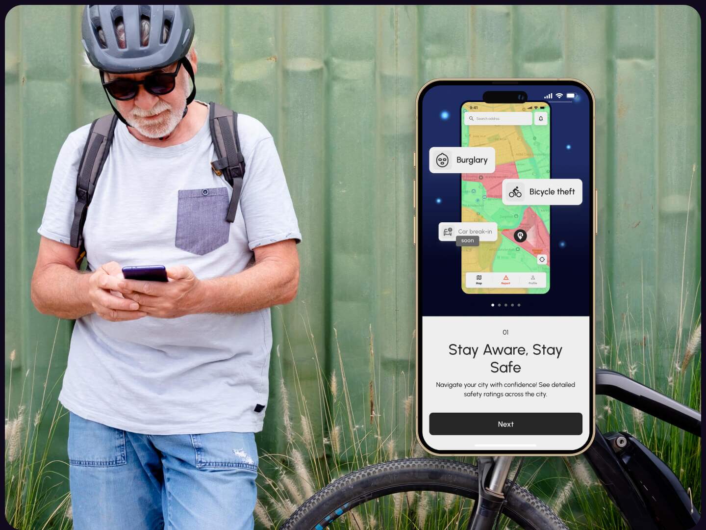
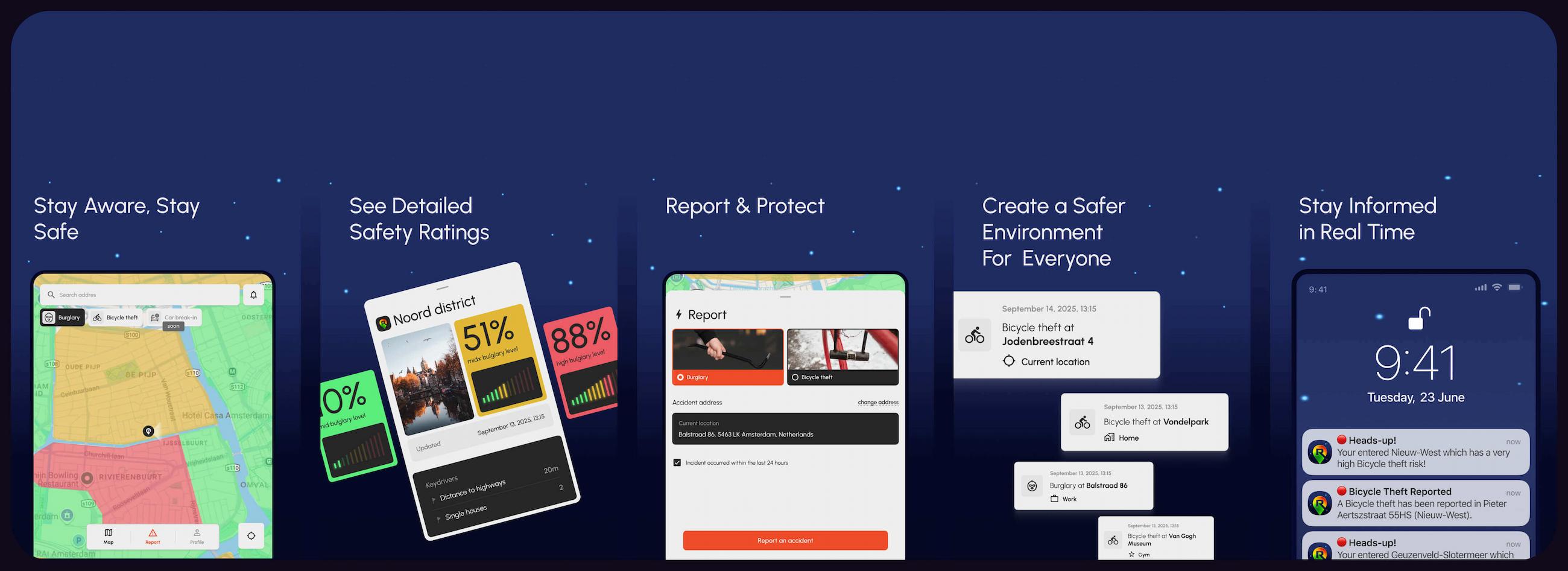
The concept of MyRiskScout was developed by risk assessment professionals from a leading European insurance company. The goal was to create a mobile app that helps users navigate the city safely through real-time risk alerts (burglary, bike theft). Risk levels are calculated using official data, police reports, and AI models. Users can also report incidents, contributing to a more informed local community. The main challenge was to translate this complex, data-driven functionality into a simple and intuitive experience.
We needed to:
The goal was to create a product that actively increases users’ sense of safety.
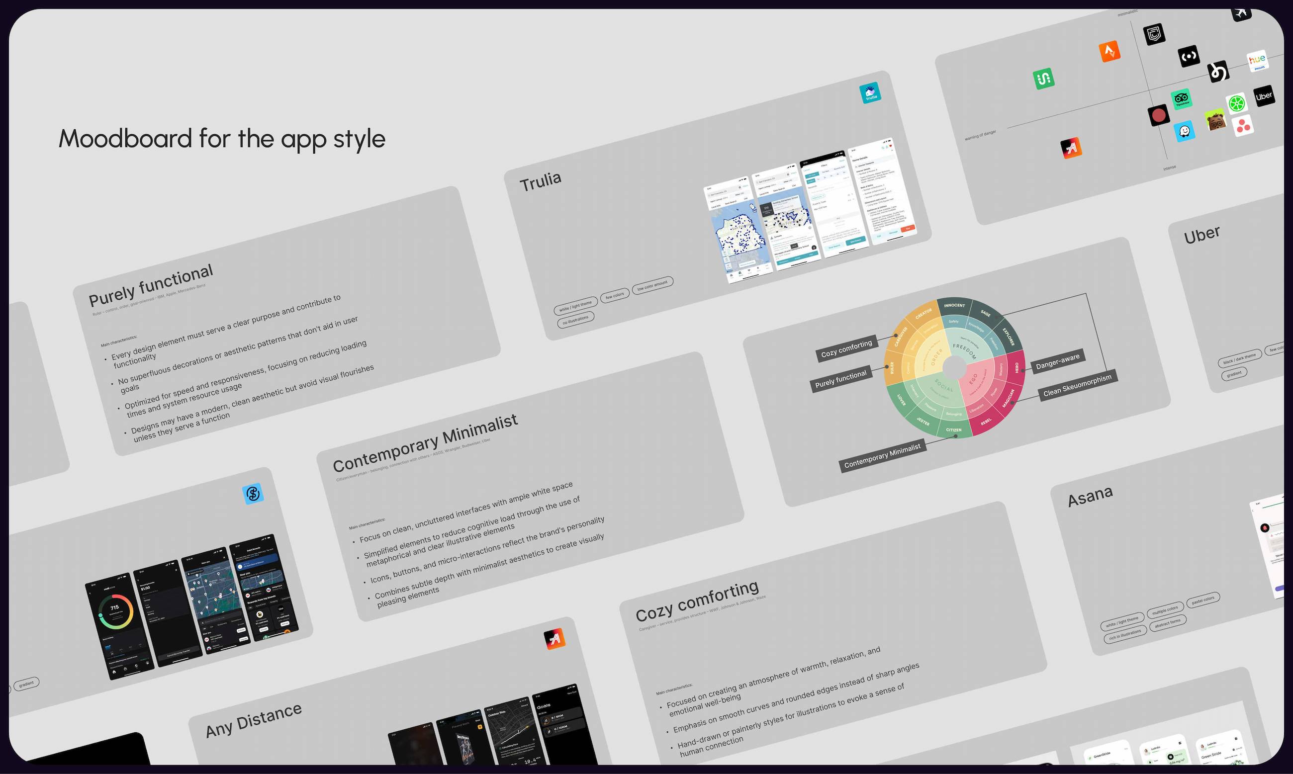
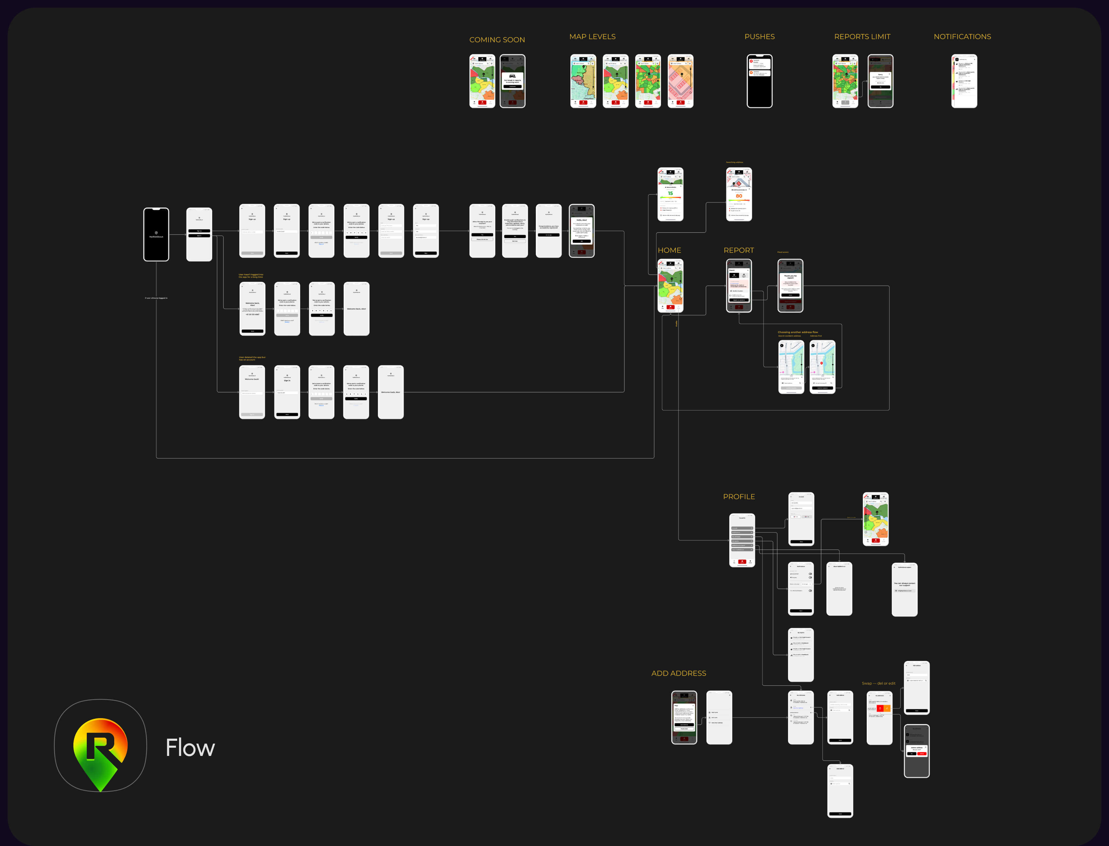
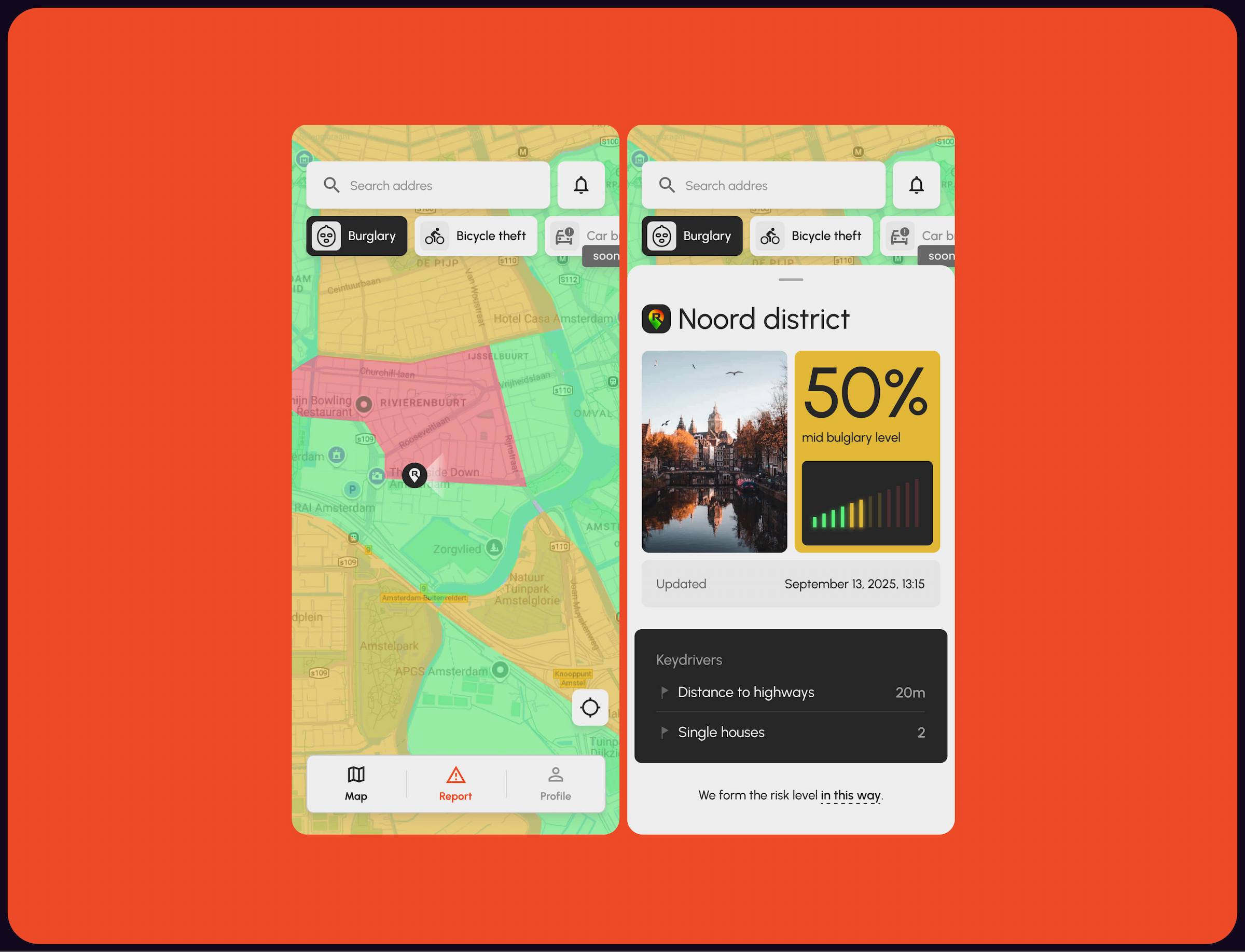
We approached the project as a full-cycle product design process. We started with moodboards and logo concepts to define the visual direction and tone of the product. In parallel, we developed a detailed user flow, covering key scenarios like map navigation, alerts, and incident reporting. After validating structure and functionality, we designed the full set of UI screens and states, focusing on clarity and speed.
The app was then developed in collaboration with homin.tech, ensuring smooth implementation and performance.
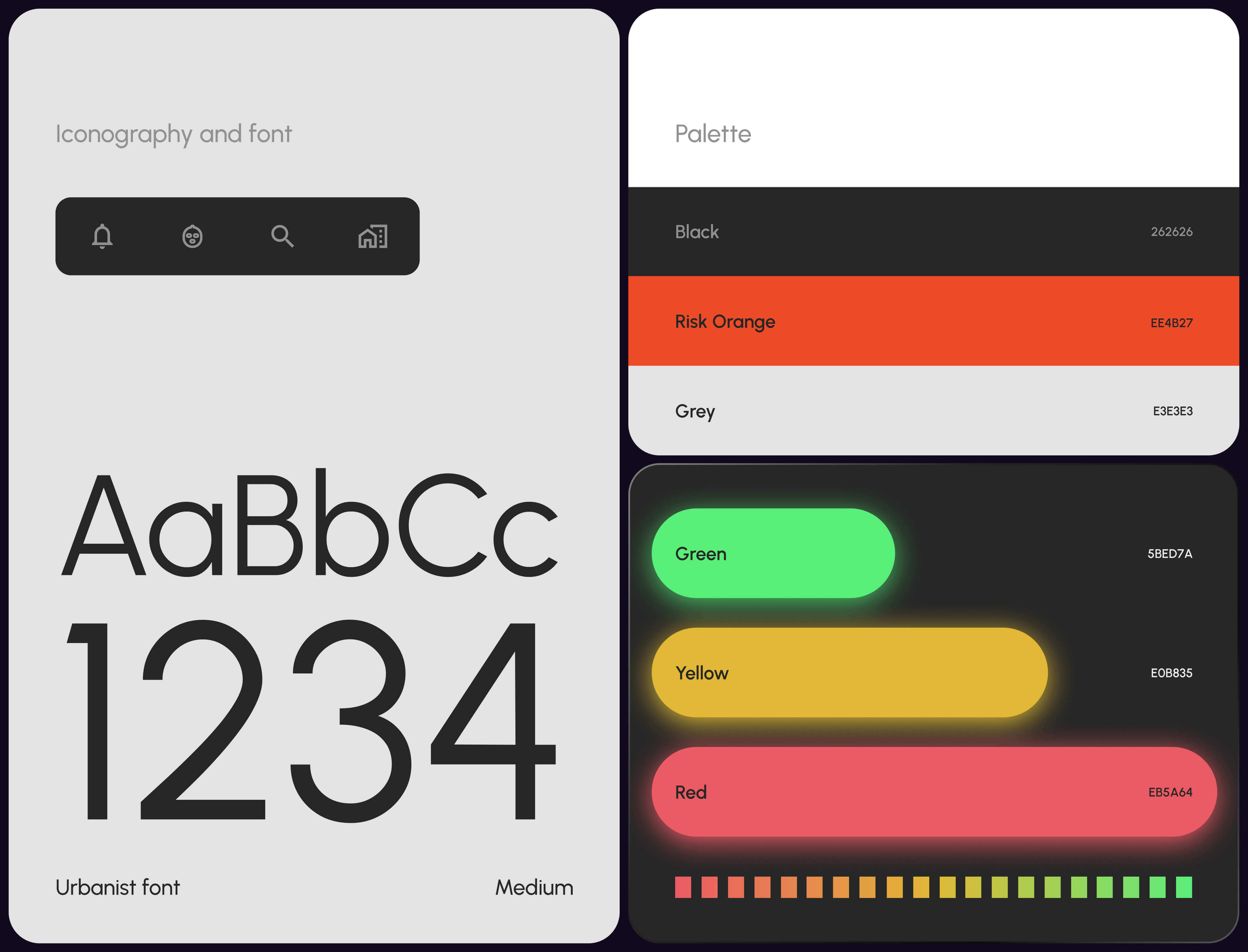
We focused on making a complex product feel simple and human-centered. Our visual direction — Clean Skeuomorphism — combines minimal UI with subtle real-world references to support spatial understanding.
Key principles:
This approach keeps advanced functionality powerful, but easy to use.
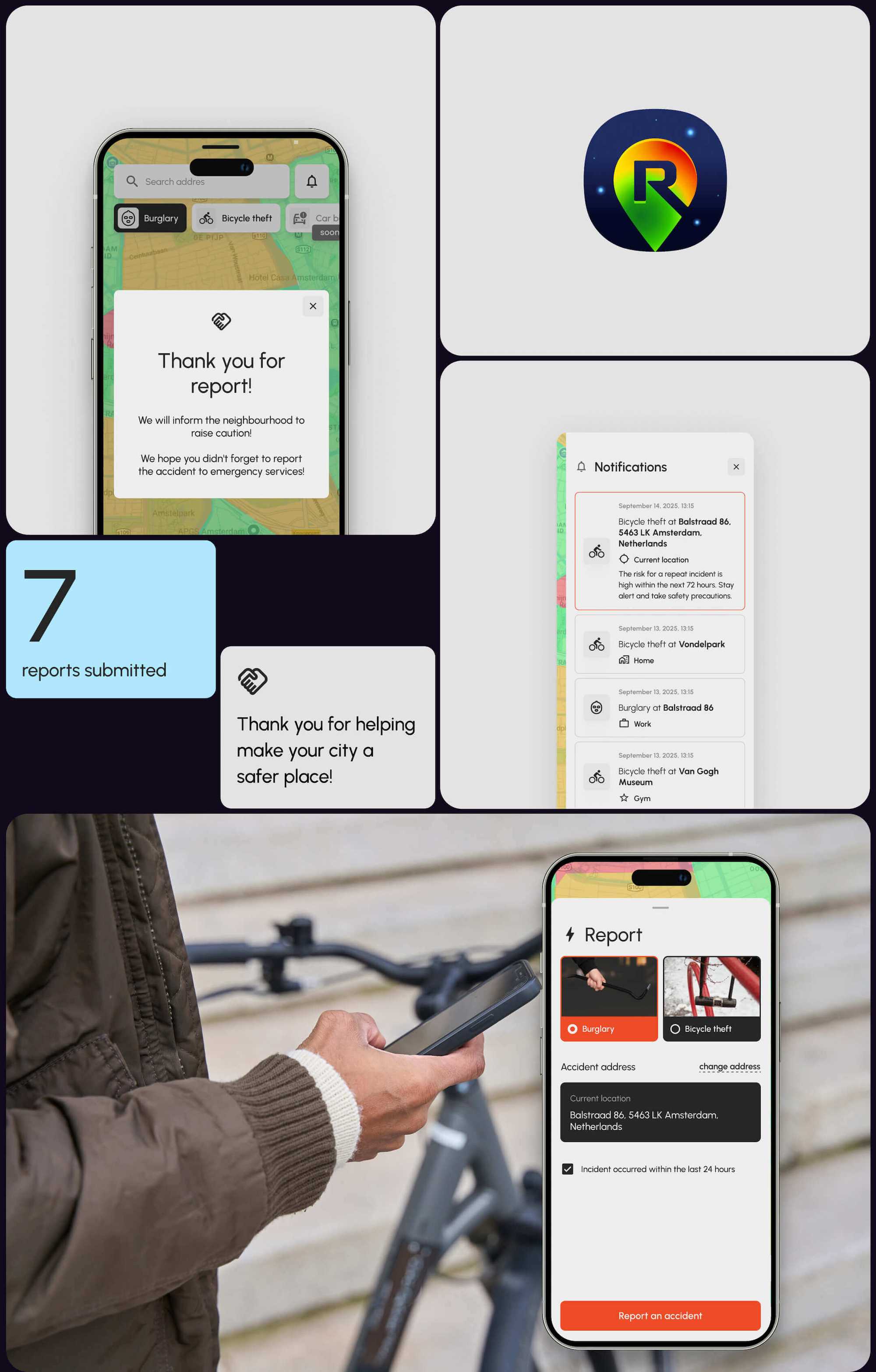
The MyRiskScout app was successfully launched as an MVP in Amsterdam and is available on the App Store and Google Play.
Key outcomes:
Impact: