Our task was to redesign the entire product and rethink its identity. We created a warm, character-driven brand that evokes the charm of vintage recipe books through custom illustrations, handwritten details, and nostalgic color accents — while keeping everything highly functional. Behind the friendly look lies a complex UX structure: recipe catalogs, thematic collections, article feeds, search, and filtering systems — all designed to be intuitive and scalable. The result is a platform that feels handcrafted yet performs like a modern digital product.
.jpg)
.jpg)
.jpg)
.jpg)
.jpg)
.jpg)
.jpg)
.jpg)
.jpg)
.jpg)
.jpg)
.jpg)
.jpg)
.jpg)
Shuba approached us with the goal of refreshing their identity and redesigning their recipe platform to better reflect who they had become. The previous website felt outdated, visually heavy, and unintentionally targeted an older audience. The brand wanted a warmer, more modern look that could attract younger readers, improve content clarity, and create a more enjoyable everyday browsing experience. We were responsible for shaping a new art direction, redefining the UX, and building a scalable design system that would support the platform’s growing recipe library.
The redesigned platform presents Shuba as a modern, inviting food destination with a distinct identity. After launch, Shuba recorded:
· +10% audience growth;
· - 30.8% reduction in bounce rate;
· +15% increase in session duration.
The new identity and UX significantly improved engagement and provided the brand with a flexible visual system they can continue using across digital and marketing channels.
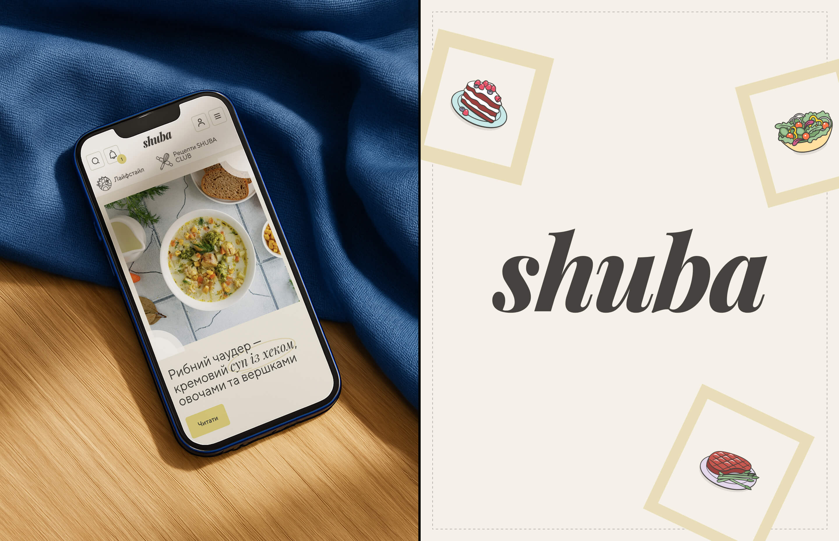
We introduced a new art direction built around a cozy, tactile atmosphere inspired by real home cooking.
The design system included:
· a soft, modern color palette that highlights photography and improves readability;
· more than 50 custom icons and illustrations that give the brand a friendly, handcrafted personality;
· typographic pairing of TT Norms Pro and Playfair Display for a refined editorial feel;
· rethought recipe cards, navigation, and content structure to simplify discovery and reduce cognitive load;
· a scalable library of components that ensures long-term consistency across the platform and social media.
The final design balances emotional warmth with clarity, allowing the content to shine without losing visual character.