How Thoughtful UI Design Boosted Engagement for Shuba.life
–30.8% bounce rate, +15% session time — powered by design logic
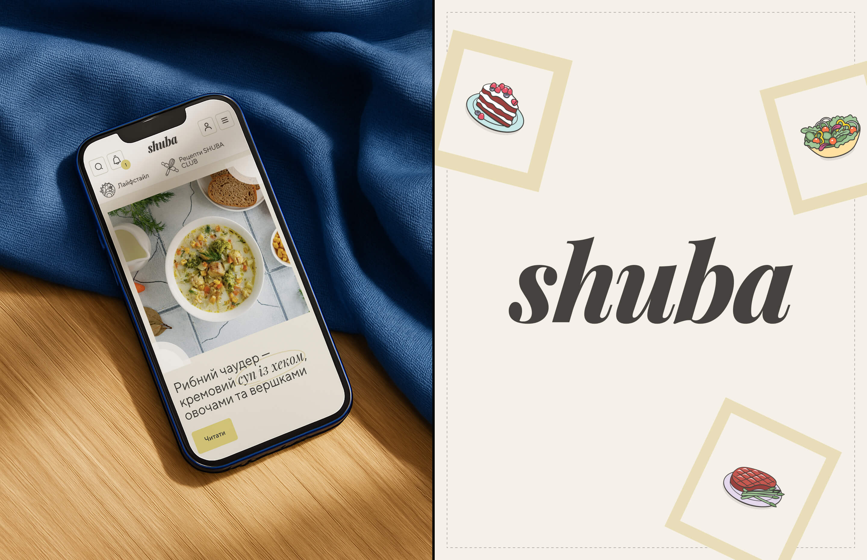
When we started redesigning Shuba.life, one of Ukraine’s fastest-growing recipe platforms, we were working with a true content giant — a food and lifestyle blog with over 1 million monthly visitors.
Shuba combines curated recipes, user-generated content, and editorial storytelling, giving readers a place to both discover and share their culinary ideas. Our goal wasn’t to reinvent that ecosystem — it was to make it feel modern, fresh, and more relevant to a younger audience, while keeping its warmth and authenticity intact.
We didn’t rely on endless research or workshops.
We relied on design logic, experience, and a trained eye.
The Challenge
For a platform like Shuba.life, engagement is everything. Readers scroll fast, skim content, and quickly decide whether to stay or move on.
The old website, while rich in content, didn’t visually support that behavior — its layout and color palette felt outdated, and it lacked a clear rhythm for navigating thousands of recipes and stories.
Our challenge: refresh the UI, improve usability, and re-energize the brand — without changing its editorial voice.
The Approach
At Snig.Digital — web & app design, we focused on the fundamentals of recipe website UX and content platform design.
We refined every detail to create a smoother reading experience and highlight Shuba’s unique mix of professional and user-generated recipes.
Our key design decisions included:
- Visual hierarchy & composition — making recipes easier to scan and navigate.
- Typography built for readability — comfortable line lengths and clear sectioning for both short posts and long reads.
- Color accents and photography framing — fresh, vibrant tones that feel appetizing yet modern.
- Interactive micro-elements — smooth transitions, feedback reactions, and clear prompts to engage with content.
Each visual choice supported a clear goal: to make Shuba.life feel more inviting, credible, and dynamic — a space people want to spend time in.
The Results
The redesign delivered measurable improvements within weeks:
–30.8% bounce rate
+15% average session duration
+10% growth in younger audience
×13 increase in reader feedback through the reaction block
For a large-scale content website with millions of visitors, these shifts mean deeper engagement, longer reading paths, and stronger community connection — all achieved without deep user research, just clear design reasoning and a deep understanding of user behavior.
Why It Worked
Great UI design for recipe blogs and user-generated content platforms isn’t about decoration — it’s about making logic visible.
Every small visual decision — where to place emphasis, how to balance composition, when to use color — affects how readers interact, scroll, and contribute.
Good UI is good UX.
When design feels right, it’s not luck. It’s the result of experience, taste, and logic working together.
The Takeaway
Shuba.life’s success shows how a strategic, design-driven approach can move the metrics that truly matter — without complex processes or massive research budgets.
For high-traffic digital publishers and content platforms, a thoughtful redesign can drive measurable growth simply by aligning visual design with real user behavior.
Ready to redesign your content platform?
If your recipe blog, media site, or UGC platform needs a design refresh that improves engagement — let’s talk
.jpeg)
.jpeg)