How we craft websites that work for 13 gamedev companies
Game studios are some of the most creative teams in the world — yet their websites often don’t reflect the same craft, clarity, or personality as their games. We see this across the industry: incredible art teams, powerful pipelines, memorable IPs… and a website that tells only 5% of the story.
At Snig Digital, we’ve spent the last few years helping game developers, art outsourcing teams, and multi-studio groups fix this gap. After designing and building websites for 13 very different gamedev companies, we’ve learned what actually works — and what studios often overlook. This article breaks down those insights, using real examples from our game studio website design projects across the industry.
What makes a good game studio website?
A strong gamedev website should:
- Explain who the studio is in one glance
- Highlight the portfolio without overwhelming the visitor
- Guide publishers and clients toward capabilities
- Guide talents toward culture and open roles
- Load fast, work well on mobile, and avoid unnecessary UI noise
This was our guiding logic across all projects below.
If you're also exploring broader redesign budgets, see our article Website Redesign Cost 2026: How Much Will It Really Cost? for deeper cost breakdowns.
Zagrava Studios: building an HR-focused digital presence
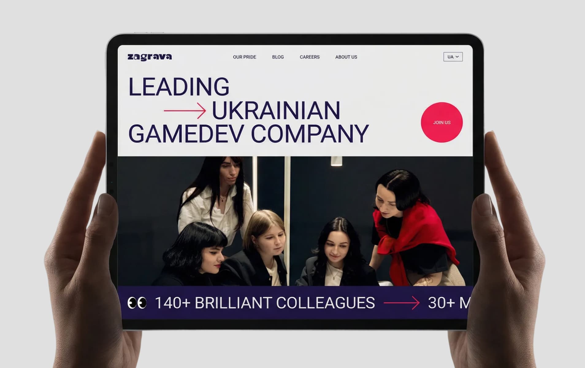
Zagrava didn’t need a website to attract clients — all commercial work comes through the parent company. The site’s real purpose was completely different: to strengthen employer branding and help the studio attract the right talent.
We created a clean, friendly, and credibility-driven website that introduces Zagrava as a stable, welcoming, and growth-oriented team. The structure, visuals, and messaging work together to present the studio’s culture, values, people, and opportunities in a clear and authentic way.
Key takeaway: when a studio’s priority is talent, not clients, the website becomes an HR engine. Employer-branding UX deserves the same level of craft and strategy as sales-oriented UX.
What the client says: “The website works beautifully and finally feels easy for us to manage — I can now publish blogs, awards, and vacancies without external help. We’re really happy with the result, and the collaboration was genuinely pleasant and productive. Getting the award was a wonderful bonus!”
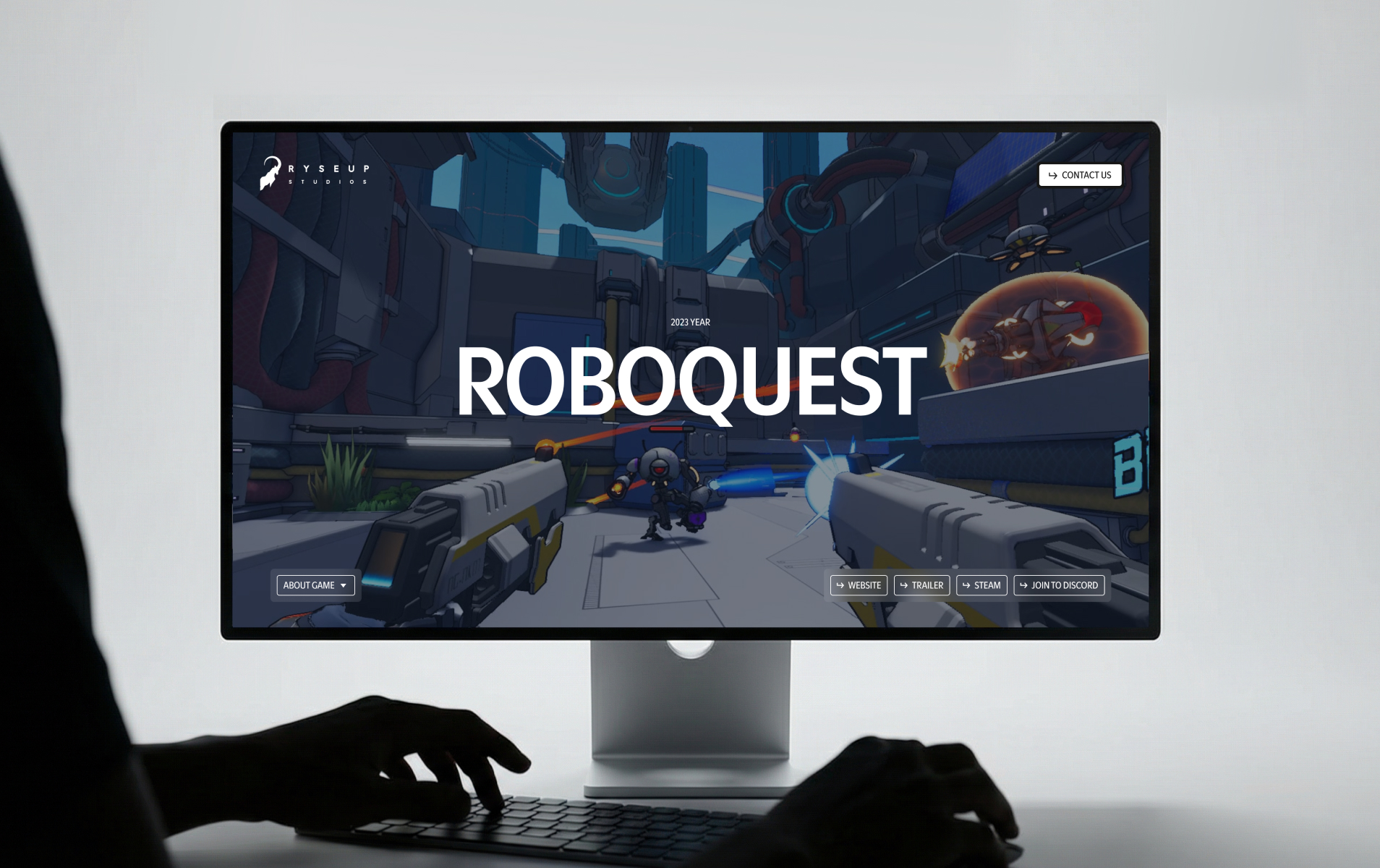
Roboquest: letting the game do the talking
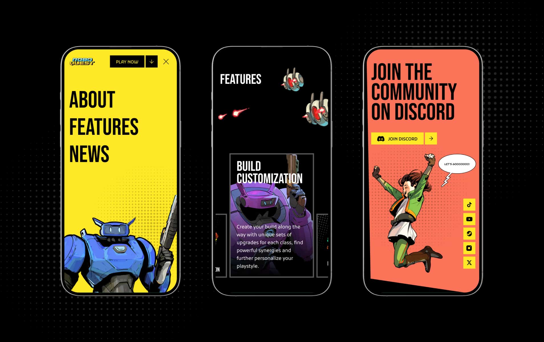
Roboquest is a fast, colorful FPS, so the site needed to translate this energy while staying usable. We created a minimal Webflow game studio website where the game itself carries the emotional weight: screenshots, trailers, key art. The homepage answers visitor questions immediately: What is the game? Why does it matter? Where can I play?
Key takeaway: for a single game website, start from content hierarchy, not visual effects.
High Palma: art, energy, and a distinct brand voice
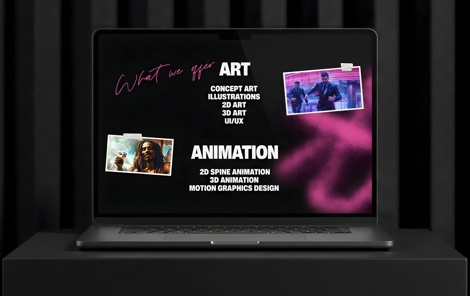
High Palma had no defined visual identity before working with us. Their art was bold — the brand wasn’t. We developed the full stylistic direction and used the website as the primary brand carrier: expressive palette, confident typography, energetic textures, and a modular layout system.
Key takeaway: when a studio doesn’t yet have a clear identity, the website can become the foundation for the brand.
RyseUp Studio: a clear start for a growing team
RyseUp needed a site that could grow together with the studio. We used Webflow for flexibility and structured the content so a first-time visitor understands the studio within 30–60 seconds. Story, mission, visual identity — all upfront, followed by projects and careers.
Key takeaway: young studios benefit from narrative-first websites with strong UX fundamentals and gamedev branding.
Artmer Studio: portfolio as a product
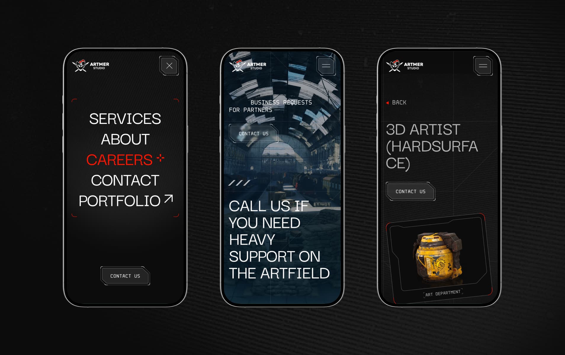
Artmer provides art outsourcing services, but unlike typical art studios, their main portfolio lives externally on ArtStation. This meant the website didn’t need to act as a heavy case-study hub — its job was different: present the studio clearly, communicate its strengths, and guide visitors to the portfolio smoothly.
Key takeaway: if your work lives off-site, the website should reduce friction and build trust. Clarity and easy routing become the core UX goals.
Room 8 Group: mapping a complex ecosystem
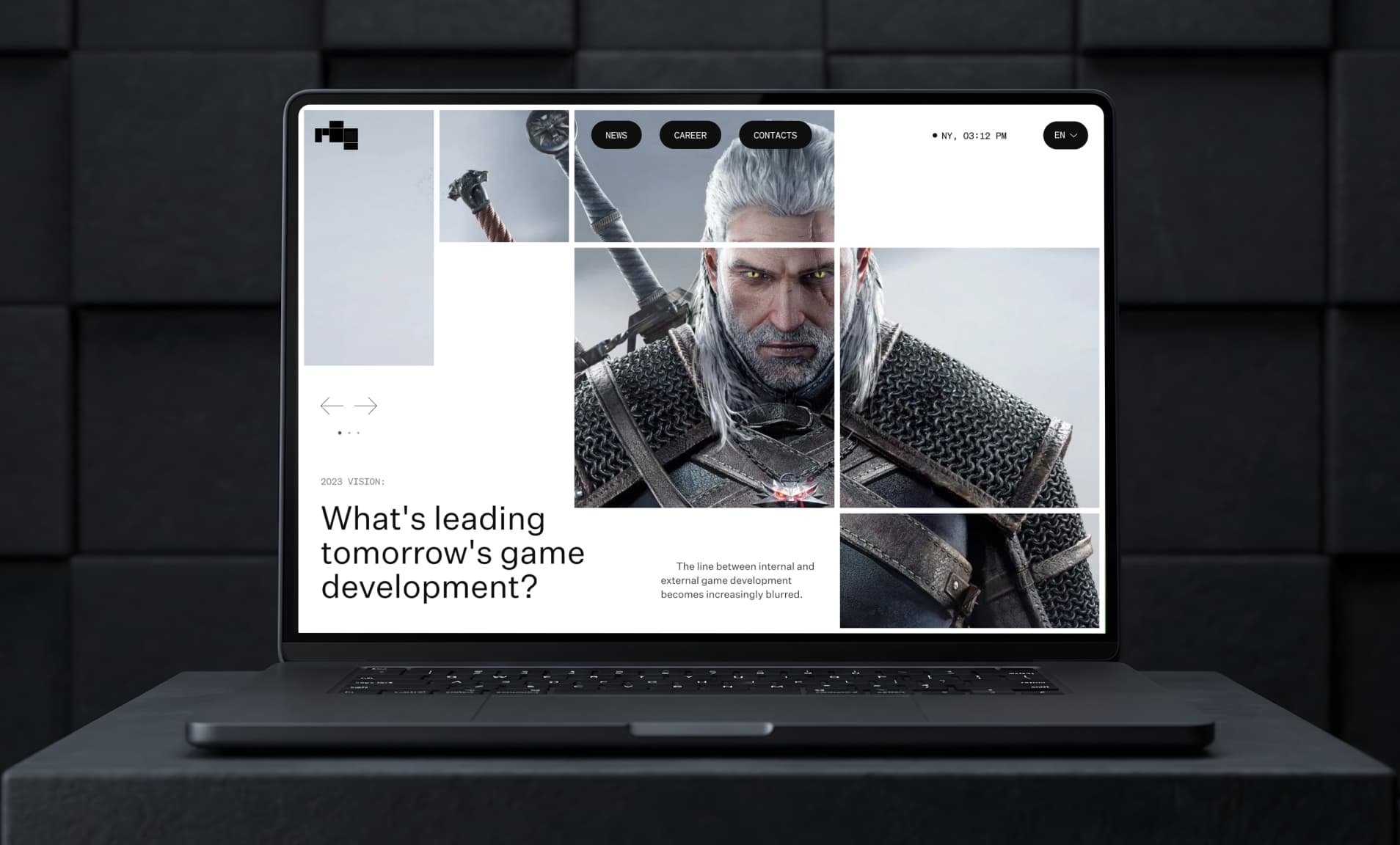
Room 8 Group unites multiple studios, so navigation became a strategic challenge.We built an information architecture that makes it clear whether you're viewing the group level or a specific unit — from art to co-development and QA teams. Stable navigation, logical content paths, and consistent components were key.
Key takeaway: for multi-unit organizations, IA comes before visuals.
Room 8 Studio: brand personality in UX details
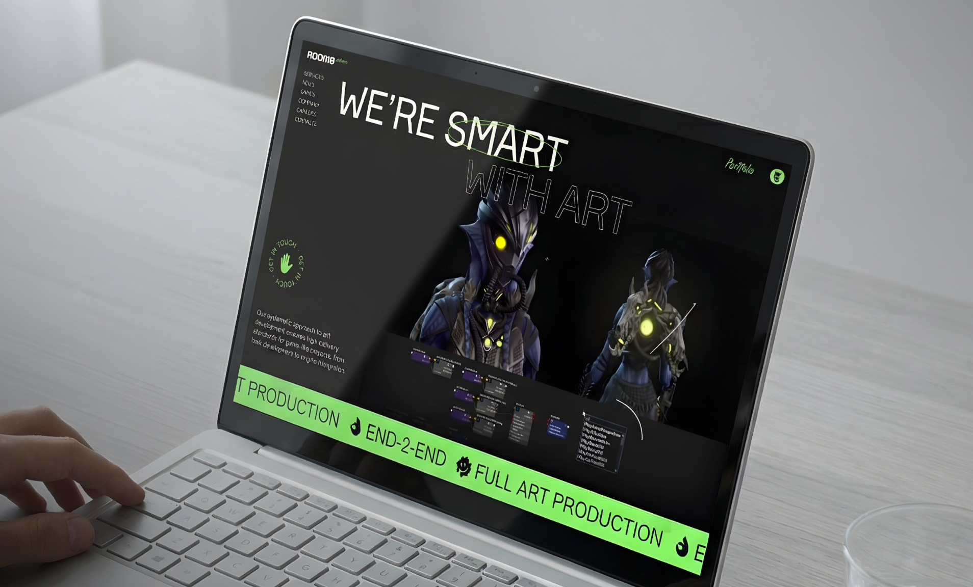
Room 8 Studio needed its own personality within the group system. We highlighted artworks, added handcrafted graphic details, and used micro-interactions to express the studio’s culture without compromising usability.
Key takeaway: small details can make a site memorable.
Solid Bash: navigation inspired by open worlds
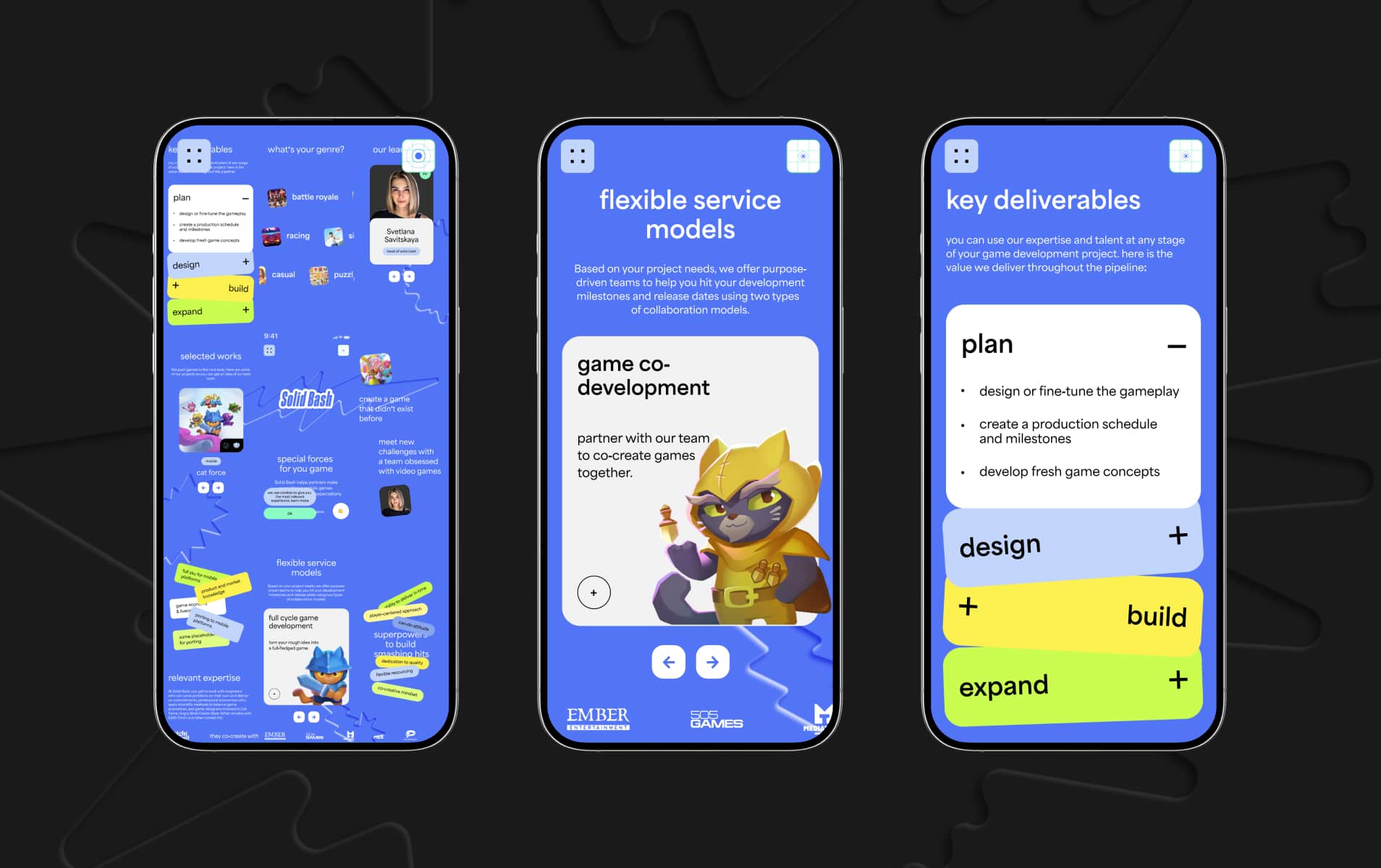
Solid Bash wanted something bolder. We created a map-like navigation concept inspired by open-world games, supported by a straightforward scroll structure and clear CTA paths. This made the site feel game-native while still following best practices of game studio website design.
Key takeaway: creative navigation works only when UX fundamentals stay solid.
VG Entertainment: a flexible home for current and future IPs
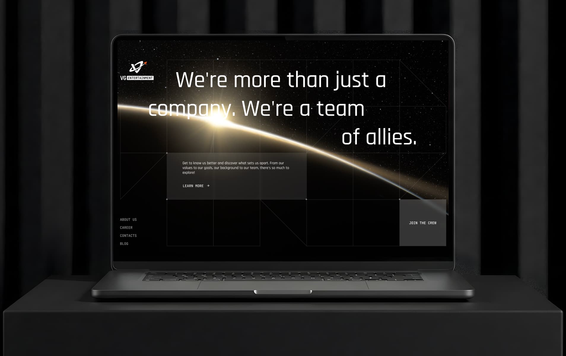
VG Entertainment needed a scalable site for announcing future IPs and sharing updates. We used WordPress with repeatable templates, clean hierarchy, and structured content blocks — a simple and effective approach for long-term game development web design.
Key takeaway: When updates are infrequent, a studio website should focus on clarity, credibility, and recruitment — not on building a content-heavy ecosystem.
Practical checklist for any game studio website
One clear sentence about who you are
- Portfolio structured by what clients actually look for
- Separate paths for publishers/clients and talents
- Mobile-first UX with reduced visual noise
- Each page tells a mini-story: context → what you did → proof
- UI stays consistent so visual content can shine
- Branding that supports (not competes with) visuals
Every studio we worked with had a different story, a different vibe, a different set of challenges — but all of them needed the same thing: a website that reflects who they truly are.
A site that shows your strengths without overselling, guides partners without friction, and welcomes new talent into your world. If you want your studio’s website to work harder — to sell your craft, communicate your vision, and stand out in a crowded market — the right structure and UX can make all the difference.
Looking to improve your studio’s online presence?
Whether you’re an art outsourcing team, an indie studio, or a multi-unit group, your website is one of your most important touchpoints. → Start a project with Snig Digital
.jpeg)
.jpeg)